There’s a new world map in town. If you missed it, the UN recently adopted a new world map, the Equal Earth Projection, which aims to portray the size of the continents more accurately – the commonly used Mercator projection distorts size at the poles. Of course, this motion might not have been a binding, but now that the new map has been been approved, expect to see the Equal Earth Projection more often, from newsrooms to map services. It might seem like a small change in the scheme of world affairs – after all, it was such an uncontroversial motion only one nation (The USA) voted against it – but there’s more going on here beneath the surface. What’s in a Map?
Maps aren’t simply a way of communicating “facts,” but convey a range of information, and the particular information you want to convey shapes the map you end up making. There’s the obvious – a political map lays out national borders, but a topographic map doesn’t. But then you have things like the South-at-top world map, which completely reshapes how we look at the world. It looks wrong somehow when you see it, but there’s no actual “up” or “down” on earth, and NASA routinely flips pictures of earth from space to keep things consistent with our expectations. And historically, it was more common for East to be at the top of the map! There’s even a delightful map which uses the Mercator projection but with a different ‘centre’, which if nothing else underscores how much distortion can occur at the edges of the Mercator projection. So there are a lot of different ways to make a map. But why does it matter? Why should we care about maps of all things, and why was the USA the one country to vote against the UN motion?
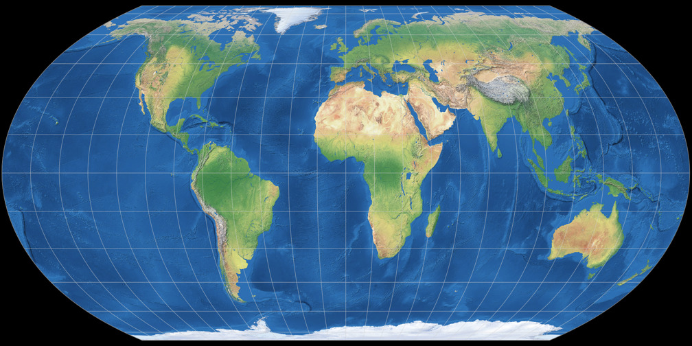
The trouble with mapping something 3D onto a 2D surface is you can’t keep everything accurate. So how do you choose?What’s so objectionable about this map anyway? Source.
Maps don’t simply communicate information: they also inform and shape what is considered true. For one example, look to Japan’s objection to the new UN maps. They made the mistake of using the same colours and shades for the the Kuril islands and Russia. Why is that a problem? Because although Russia occupies the Kuril islands and has since 1945, and went so far as to annex them, Japan still claims sovereignty over them and disputes Russia’s control. To colour the Kuril islands like Russia is, accidentally or intentionally, to take a side in a political dispute. The same can be said of the Crimean Peninsula, occupied by Russia, following an invasion of Ukraine in 2014. And then there are places like Kashmir or Southern Sahara, where the way a border is drawn can say a lot about the perspective of the map-maker.
And this goes well beyond the borders of a map. Is it called the Gulf of Mexico, or the Gulf of America? Do you call the water behind the Straight of Hormoz the Persian or Arab Gulf? It’s no coincidence that Google Maps, a service provided by an American corporation looking to please the current administration, has already added “Lake America” to the end of Lake Ontario. Maps convey ownership and power just as much as they do a river or mountain range. Even using the name and borders of something like “America” is a kind of political decision: the landmass wasn’t called that before the colonists arrived, and what’s now North America once contained hundreds of nations, many of whose peoples are still around today. Why don’t we use their names and borders for the region? After the Armenian genocide, the names of towns and geographic sites were erased, and new Turkish names became the norm – and the same has happened again in Palestine. As new names appear on the maps, eventually people forget that the names used to be different, that the change represented the displacement of people and the erasure of this history and culture. Maps legitimise and establish political control, and provide a kind of legitimacy to annexation or colonisation.
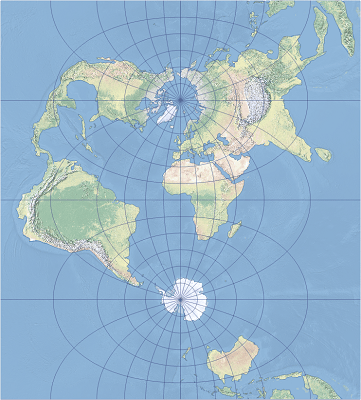
It’s as I look at this Transverse Mercator map, in which the continents look nearly unrecognisable and South East Asia becomes bigger than Europe, that I start to wonder just how distorted the Arctic must be on “normal” maps. Source.
Why did the African Union bring this motion to the UN? Well, perhaps because the Mercator projection shrinks Africa in comparison to North America and Europe. It makes Greenland look almost the same size as a continent fourteen times larger than it! This impacts how we understand Africa and its place in the world, the way it so often becomes an afterthought in conversations about history, technology, and culture. And the politics of map-making was laid bare when the US called a simple vote on what map to use a “radical ideological project” – incidentally, the USA is one of the countries most affected by the map change, shrinking notably in an Equal Earth Projection. Huh. Funny that.
Now to be clear, Mercator isn’t wrong and it’s still useful, especially for navigation. But I do wonder why a navigation chart became our standard way to represent the world. And I can’t help but notice that the map is especially useful for Europeans and North Americans, who represent less than 15% of the world’s total population. Far more people end up being squashed together under Mercator than are given a better view of their borders. The Global North is where we find almost all of the world’s historical imperial powers and colonial holdouts, and its their regions who benefited from us all using Mercator. It made their part of the world bigger, and we are prone to associating something big and at the top of a map as being more important. If you don’t believe me, study the Australia at top map and think about how much less significant Eurasia and North America feel once they’re pushed down to the bottom of the map.
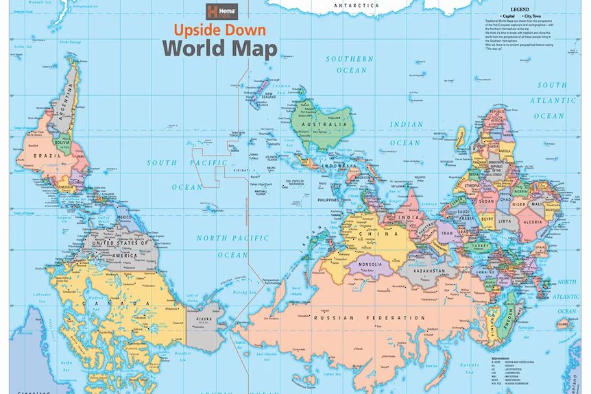
The projection on this map isn’t even different – all it’s doing is swapping which pole we put on “top.” Yet it gives the same feeling as seeing food coloured the wrong way. Just imagine how strange it would look if we combined this with the Equal Earth Projection… Source.
The trouble with “common sense” is that the things we uncritically accept can disguise quite a lot of political and social ideas. Maps aren’t neutral things, conveying information dispassionately in an objective format. Anyone who tells you they are is either trying to trick you, or has already been tricked by someone else, and sometimes the person telling you something is just commonsense is hiding an agenda. Maps have meanings, and convey not just information, but ideas about which information is important and true, and which is irrelevant. The legitimisation of maps helps us to forget that the thief doesn’t own the things they steal, and it silently ends political disputes by making one claim to sovereignty or control correct. I’m thankful we’ve a new world map to reference, one which reminds us of how big places like Africa and South America really are. I only wish we’d do more to dislodge our presumptions, to remember that things like maps are just as political as they are scientific, and take notice of the way a name on paper can legitimise wrongdoing by making it an immovable fact of life.
And anyway, what’s the point of a world map if not to tell us how big the continents are?
– The Teaspoon


Leave a Reply